How I'm Transforming My Living Room To Match My Vibe Part 3
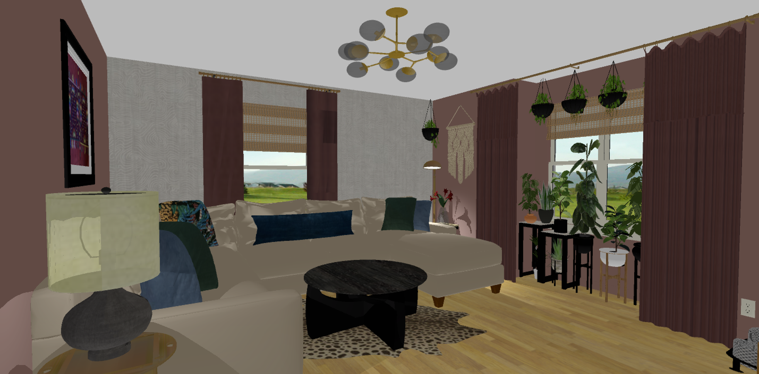
I wanted to share a work in progress on the design plan with you guys - the 2D mood board and 3D views.
If this is your first time reading about my living room makeover, check out part 1 here and part 2 here to catch up.
Back to the update. You’ll notice that there was a change in the wallpaper selection and that’s because a brand hit me up to sponsor the wallpaper and I said why not. That sponsor is Photowall and they have traditional wallpaper options with an easy installation method you can watch here, you can upload your own pic and have them create a mural for you or choose from their artwork. Pretty dope!
So I looked over their options and really fell in love with a grafitti/affirmation wallpaper (first set of pics below). I thought that it was the perfect way to showcase our love of hip hop and wellness into the space, but only Lele and I felt the love. I’ll stick with my original plan of having Robert create a grafitti art piece instead.
I ended up compromising on something all of us loved, which you’ll see as you scroll down on the post (second set of pics). The pictures don’t do it any justice, but I truly love how it has the look of the inside of a tree trunk and ya’ll know how important it is for me to feel grounded in my space. Photowall had a few color options for this pattern and I ended up going with their beige option instead of the taupe because I’m aware how the lighting in my home affects colors so in the end the beige option will look darker than what you see here.
The one thing that is so important when it comes to a design plan is visualizing the space done because although a mood board and 3D view are meant to help you see the final look, they never can really capture the final look realistically or do it any justice. In other words, the real thing is always more beautiful than what any software can create. So having an open mind is key. Period!
The wallpaper that had my heart
Another view of the wallpaper
The wallpaper all of us agreed on
Another view of the wallpaper
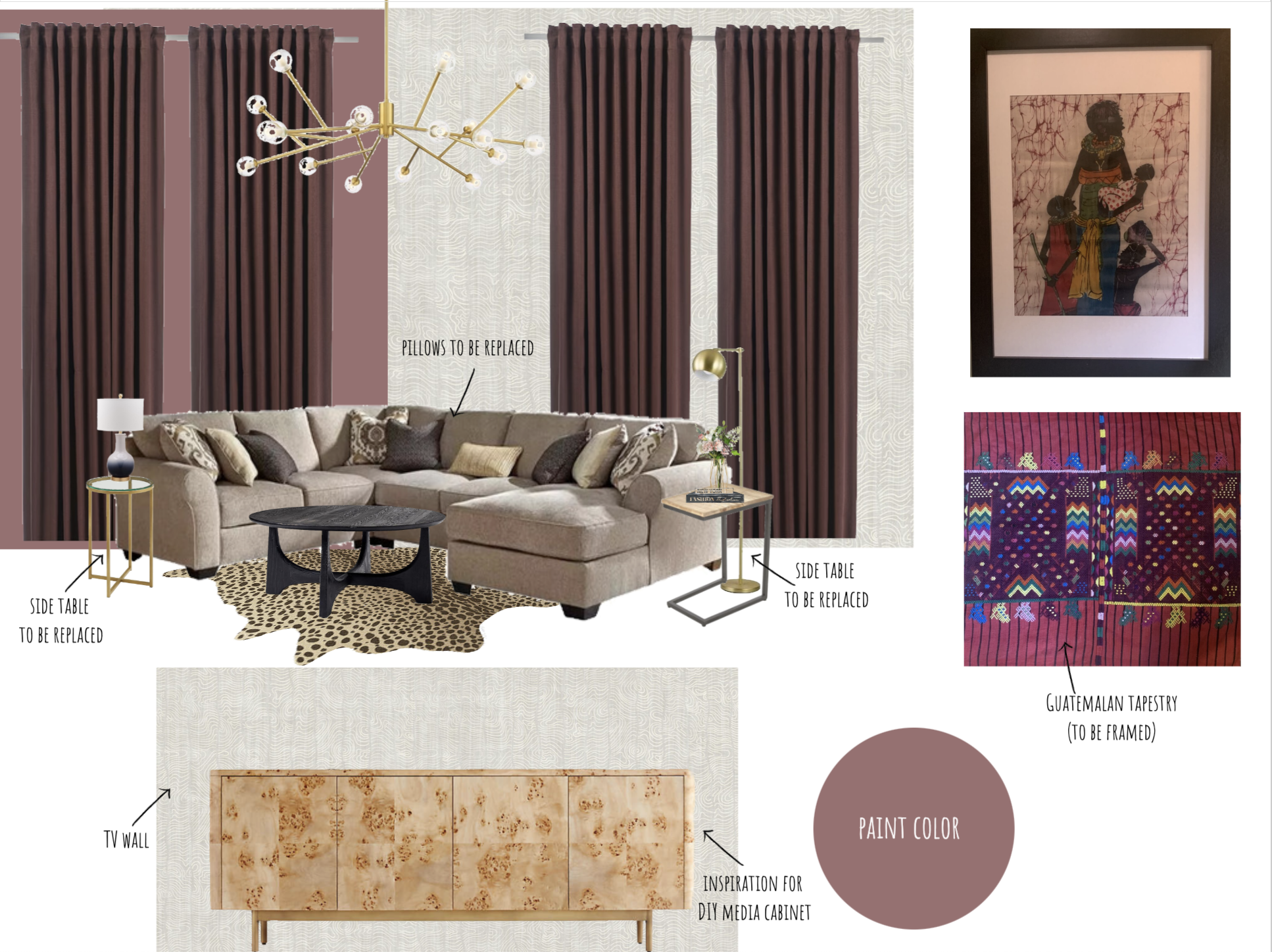
The 2D moodboard of the space
Now I must say that I did not get a sample of the wallpaper before hand, which is something I never recommend, but I have a really good feeling about the color and tone of this wallpaper, so I went with it. They also have a refund policy that I can always fall back on.
So this is the foundation of the design. I’m still looking to solidify many of the pieces like the chandelier, side tables, etc, but this is the overarching vision for the space - moody and culture infused meets boho modern.
Let’s discuss some details about the design and some challenges:
In part 1 of the living room makeover post, I shared how important it was to showcase our cultures in the space so I decided to bring in two fabric art pieces that do just that. The first piece that you see framed on the moodboard, I got from a local African shop in Union Square about 20 years ago that I fell in love with as soon as I spotted it. The second fabric piece is a Guatemalan tapestry my mother gifted me years ago from her last trip back home. It’s so synchronistic how the colors in both pieces blend so well together. They are the inspiration for the color palette in the space.
I’ve been looking for a large chandelier that can disguise the fact that the positioning of the electrical connection for the chandelier is not centered on the ceiling and because your girl isn’t doing any electrical rewiring (it aint that serious), we are improvising. So my vision is for a large piece with a lot to offer visually so that it will mask the fact that it won’t be centered in the room. I also decided on hanging the wallpaper on the sofa wall as well to take away from it’s large size so basically the wallpaper will be the attention grabber of the space instead of the oversized sectional.
The coffee table caught my eye because of the color and also because I’ve been searching for a durable coffee table that Taz couldn’t eat and that wasn’t bulky. In other words, I didn’t want to add to the bulkiness of the sectional by adding a chunky coffee table, which would make the room feel and look really heavy. So I was on the hunt for something that felt visually light yet was Pitbull durable. I love how this piece is large enough to pair with the sofa, yet will allow for us to stretch our legs when sitting down which is super important since we are a tall family.
Onto the rug. Remember how I said that I wasn’t sure if we’d be adding one because of Taz. Well Ruggable finally added a hide rug shape to their collection and thank all the Gods because now I can have a rug! In case you haven’t heard of Ruggable, they offer rugs that you are able to wash in your washing machine. Perfect for those of us who really like to live in our space, have pets, kids, etc.
Well that’s what’s new, but click here to see the next updates on the living room makeover.
Disclaimer: This blog post contains affiliate links. If you click on a link and make a purchase, I will earn a commission (at no additional cost to you). I only recommend products and services that I have found to be helpful and trustworthy. For more information, see my terms + conditions page here. Thanks so much for your support.
Want to finally transform your space to match your vibe?


